From Complexity to Clarity:
Transforming How NBCUniversal Manages Their Title Metadata for 177+ Platforms
Company
NBCUniversal
Role
(Dual-role) Junior UX Designer and Product Owner
Duration
1 Year (January 2025 - January 2026)
Team
Director of Product, Product Managers, Product Owner, Integration Analyst, Director of Software Engineering, Manager of Software Engineering, Software Engineers (Vietnam, the UK), QA, Project Managers
Key Skills & Tools
Figma (UI, Prototyping) // LucidChart (Flow Diagrams, Personas, User Research) // Jira (Agile SAFe, User Story Ticket Writing, Engineer Collaboration)
The Business Challenge
Constraints
Working with Design Systems & Engineering Limitations
I designed a table with double headers to clearly show the hierarchy between Season and Episode, but the engineering team does not support this design. Therefore, I have to of a new way to workaround by combining header names, and clearly display the hierarchy with columns.
BEFORE

The table design is not supported by the engineering team.
Hi-fi Wireframe
AFTER

In the new design, I removed what cannot be supported, combined header names, added "Title Type" to clarify the difference between titles and implemented column settings feature for users to hide unwanted columns to further optimise their workspace.
Hi-fi Wireframe
Striking the Balance between Innovation & User Habits
Our users are very used to current navigation bar and how they viewed the metadata in our legacy systems, so I have to compromise and implement them instead of innovation.
BEFORE

In the legacy system and latest internal product ecosystem, users are used to viewing data in columns and in-line editing.
Developed Product Screen
FAILED APPROACH

My concept design changed the navigation bar which is not supported by the current design system, and the way user edits metadata. The concept is not clear enough and input fields adds more lines to the interface which increases visual clutter.
Hi-fi Wireframe
AFTER
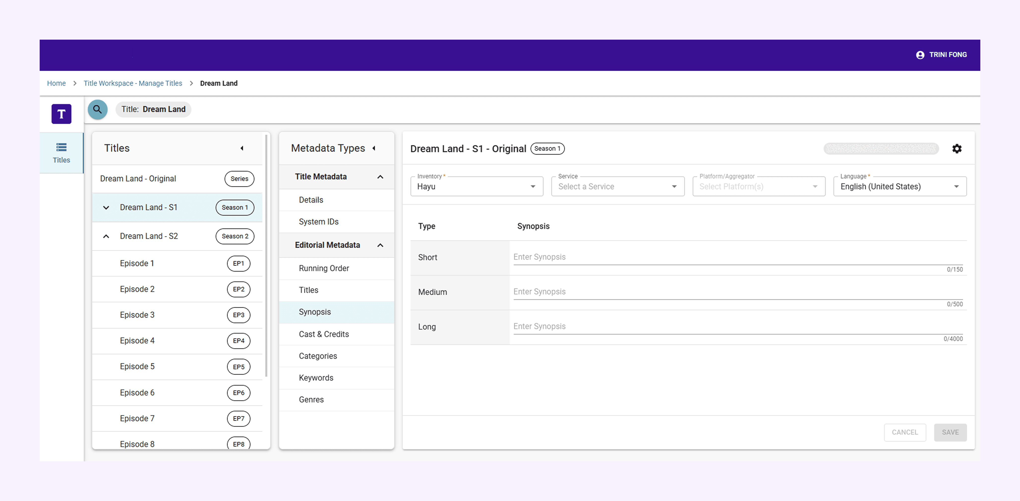
The new design keeps visual noise to the minimum. Displaying only the necessary fields.
Developed Product Screen
Following Accessibility Guidelines & Matching Design Consistency
I worked with another UX designer from the US on the designing for accessibility. As much as I wanted to use different colours in my first draft, it did not match accessibility guidelines due to the low contrast level. The engineering team does not support double nesting as well so we had to change the way we structure.
BEFORE

AFTER

This is one of the first strategy projects for the department so we had a lot of discussions with senior stakeholders on the right approach. This prolongs the discovery process, and left me only 2 weeks to finalise the design for the proof of concept.
User Research & Solution Design
We interviewed each core user group who is using the existing legacy system from EMEA, LATAM and DreamWorks, to document their workflows and understand their goals and pain points.

I identified user pain points and come up with solutions to solve them, in consideration of what the business requires.

Then I summarised all the findings into a persona, key insights and user goals to shape the direction of UX design.
Key Design 1: Making more space within limitations
Problem
The issue with data being cut off is due to the large amount of data grids and the product not being responsive for our work laptop with 13" inch screens.
Limitation
The engineering team does not support responsiveness development for 13" inch laptop screens, as it is assumed that they will use the company's monitor.
Solution
Utilise the expand and collapsible features of Navigation Bar to allow more working space for the metadata as much as possible.
Review mandatory fields and hide them by default to save space.
BEFORE

In the latest internal product ecosystem, when the screen size = 100% on 13" inch laptop, the majority of the data has been cut off, and the horizontal scroll bar is barely visible.
Developed Product Screen
AFTER
In the new design, even when screen size = 100%, all data can now be seen.
Developed Product Screen
Key Design 2: Reducing User Processing Time by 66%
Problem
Redundant user interfaces, irrelevant fields, unclear title structure, key metadata management module separated from original workflow
Limitation
Users are used to data grids so we cannot remove this design entirely
Accepting the difference in design between prototype and actual developed product. Functionality comes first in B2B Products.
Solution
Combine separated module
Review existing workflows to remove fields that are no longer relevant to the users
Simplify the transition between different metadata types and titles.
Make use of automation and default population features
BEFORE

Redundant User Interface - confused user on where to input metadata.
Developed Product Screen
AFTER

Mandatory Information are displayed once only, making the experience intuitive and clear.
Developed Product Screen
BEFORE
Old system took around 1 minute to create the title, and it requires extra effort to add the number of episodes.
Developed Product Screen
AFTER
The new title creation process only took less than 30seconds as smart data population feature is implemented.
Developed Product Screen
The Dual Role
In May 2025, all the above designs were presented during the Proof of Concept Review with senior stakeholders. The concepts received the green light to move forward. At the same time, the Original Product Owner departed.
I stepped into the Product Owner role and transited into a UX Designer who thinks strategically about how to build the product step-by-step. There's only 7 months left, and I'm responsible for delivering all the MVP capabilities.
My new daily life now includes raising user story tickets (37+), rapidly producing hi-fi wireframes and prototypes, collaborating closely with engineers and engage in all meetings related to the product.

Snippet of my Figma File: I developed a prototype for each feature. One Flow Prototype = One Ticket = One Feature
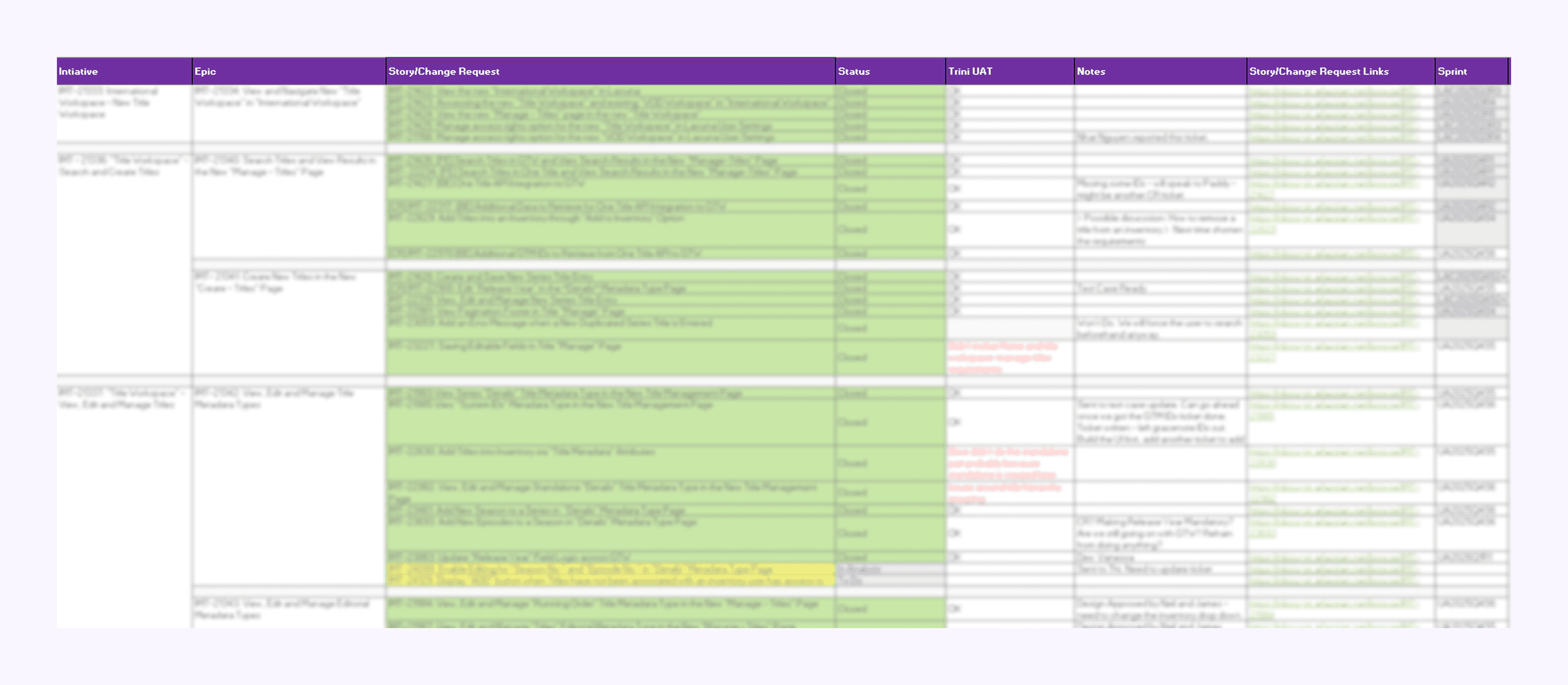
Tracking every ticket status in Excel (Blurred due to confidentiality)

I understand how to actually build the product by raising tickets (Blurred due to confidentiality)

Flow Diagram Documentation
(Details not shown clearly due to confidentiality)
Solving Problems for the Long Term
Step 1: Consider the Unhappy Paths to Prevent Human Errors
Working with the engineers have taught me to consider all the unhappy paths and behaviours for all the features as a whole, not just a specific workflow.
For example, designing confirmation pop-up when user wants to clear all the existing data, to ensure this action is not an accident.
Developed Product Screen
Step 2: Consider the Future Enhancements
No product is final, as it will be updated continuously to meet different user requirements in the future when the company expands. We designed space intentionally for future implementations, and experimented with AI to see how well it translates our metadata into different languages.

Designed for future enhancements and metadata types
Developed Product Screen
Stakeholders Communication
Product needs to be tailored, so does Presentations.
As a product owner, I have to give updates and present the progress of our product in project updates meetings with all the project managers, the key stakeholders and weekly project catch ups.
I have learnt that it’t crucial to understand what each key stakeholder group is concerned about, and mention it before they even ask the question:
For example: A stakeholder group is concerned about how to add a new season into a series after creating. In the next Presentation, demo that specific workflow during the process or address the new updates that are related to their concern first.
[Presentation documents are confidential, please reach out for more details.]
Impact
⬆︎ Increased Employee's Productivity by
~3x
⛳︎ Built a Single Source of Truth for
379,770+
titles and their metadata
⬇︎ Reduced User Processing Time by
66%
↔︎ Expanded the metadata management support for
177+
Global Platforms
Key Learnings
We cannot solve all problems at once.
In B2B products, I learnt that we cannot solve all user pain points at once. There are still a lot of pain points that can be solved, but with limited time and budget, we need to put our eyes on the MVPs first and build a backlog for the advanced features.
Work with Engineers, look at both the front, and the back.
In this project, I've learnt how to work with engineers on a daily basis. I learnt how to strike the balance between being too detailed or too brief when writing specifications and in communications. Unclear acceptance criteria leads to confusion and prolongs the process, same goes for unclear user interfaces prototypes. Answering their questions everyday helped me to gain a whole new perspective on how a product is built and developed, not just the front-end design.
Developing Product in an Agile SAFe Environment
From designing the experiences and interfaces based on the information architecture, refining my designs in design review sections, breaking down the project into initiatives, epics, and stories, raising user story tickets, engage in sprint refinements, collaborating with engineers and lastly testing the product, I learnt that designers sketches dreams, and engineers bring them to life. Engineers have all my respect!
What's Next?
Continuous Improvements & Onboarding New Users
This is a product that will be continuously improved when more users are using it as part of their workflow. We are only in the early stages of the product, and I laid out out the foundation of this global data governance product.
We will be onboarding new users, designing data approval workflows to strengthen the data governance process and experiment with AI to populate metadata where it fits.
Currently, I'm designing another user interface and experience for a scheduling product within the same internal product ecosystem. If you want to find out more, I would love to discuss my concepts during interviews!